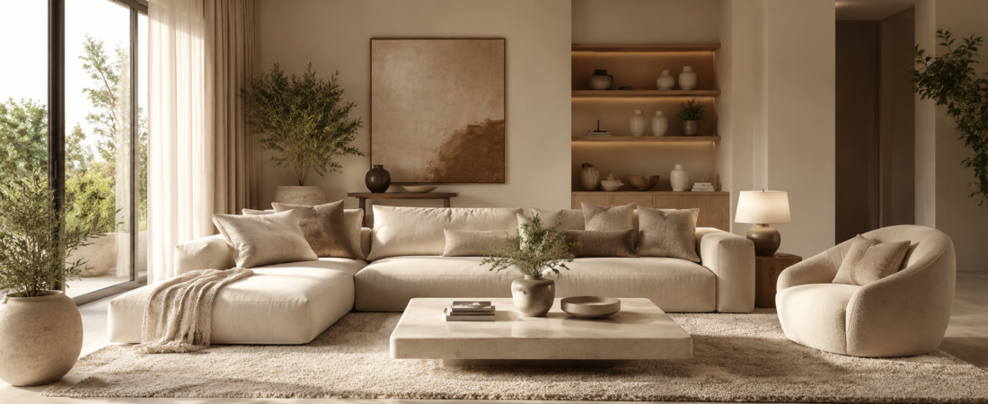
What Is Monochrome Interior Design? Monochrome is a decorating style that uses different shades, tones, and tints of one main color throughout a room. Rather than filling a room with many contrasting colors, this style focuses on variation within a single color family. A monochrome room can feel calm, elegant, modern, dramatic, or cozy depending on the chosen color and how its lighter and darker versions are used. White, beige, gray, blue, green, and even black can all work beautifully in a monochromatic interior.
What Does Monochrome Mean in Interior Design?
In interior design, monochrome means building a room around one dominant color and using several variations of that color throughout the space. This does not mean every surface needs to match perfectly. Instead, designers combine different shades, tints, and tones to create visual depth. For example, a blue monochrome bedroom could include pale blue walls, a medium blue headboard, navy cushions, and blue-gray bedding. The colors belong to the same family, but their differences prevent the room from looking flat or overly matched.
How Does Monochrome Interior Design Work?
A successful monochromatic room usually starts with a base color and then introduces lighter and darker versions of it. The lightest shade might appear on the walls or larger surfaces, while deeper tones can be used for furniture, artwork, rugs, or decorative details. Texture becomes especially important because there are fewer color changes to create contrast. A velvet chair, woven rug, linen curtains, smooth wood, and ceramic accessories can all add interest even when they follow a similar color palette.
Is Monochrome Interior Design the Same as Black and White?
Not necessarily. Black-and-white interiors are often described as monochromatic because they rely heavily on the contrast between black, white, and gray, but monochrome design can use almost any color. A room decorated entirely around shades of green, brown, blue, pink, or beige can also be monochromatic. The defining feature is not the use of black and white; it is the concentration on one color family and its variations.
Why Is Monochrome Interior Design So Popular?
Monochrome interiors are popular because they create a strong sense of visual consistency without requiring complicated color combinations. When the shades are chosen carefully, the room can feel organized and intentional. This approach is also useful for people who prefer calm surroundings or dislike spaces that feel visually busy. Because the color palette is controlled, furniture and architectural details can become more noticeable, allowing materials, shapes, lighting, and textures to contribute more to the overall character of the room.
Benefits of a Monochromatic Interior
One major benefit of monochromatic decorating is that it can make a room feel cohesive from one end to the other. A limited color palette can also make decorating decisions easier because new furniture and accessories only need to work with an established color family. In smaller rooms, lighter monochrome palettes can create an airy and open feeling, while darker palettes can make larger rooms feel warmer and more intimate. The style is also flexible enough to work with modern, traditional, minimalist, rustic, and contemporary interiors.
How to Choose a Monochrome Color Palette
Choosing the right color is the first important step. Think about the atmosphere you want before selecting paint, furniture, or accessories. Soft beige and cream can create a warm and relaxed environment, while different shades of gray can produce a refined contemporary look. Blue can make a bedroom feel peaceful, green can bring a natural quality indoors, and deeper brown shades can create a cozy appearance. Once you choose your main color, look for several lighter, medium, and darker variations rather than relying on one exact shade.
Use Different Shades to Create Depth
The biggest mistake with monochrome decorating is assuming that everything should be the same shade. That can make a room look flat and lifeless. Instead, use contrast within the chosen color family. A pale wall can sit behind a medium-toned sofa, while darker cushions or artwork provide additional depth. Even a subtle difference between warm white, ivory, cream, and beige can make a neutral monochrome room feel much more layered and sophisticated.
Add Texture to a Monochrome Room
Texture is one of the most important elements in monochromatic interior design because it gives the eye something to explore when there is limited color contrast. Soft fabrics, natural wood, stone, glass, metal, woven materials, and textured walls can all make a difference. Imagine a beige living room with a linen sofa, wool rug, boucle chair, wooden coffee table, and textured curtains. The colors may be closely related, but the different surfaces make the space feel rich rather than repetitive.
Monochrome Living Room Ideas
A monochrome living room can be both sophisticated and comfortable when the palette is layered carefully. A neutral version might use warm white walls, a cream sofa, beige curtains, a taupe rug, and light wooden furniture. For something more dramatic, different shades of charcoal and gray can be combined with darker furniture and soft lighting. The goal is to keep the main color family consistent while using furniture shapes, fabrics, artwork, and lighting to stop the room from feeling one-dimensional.
Monochrome Bedroom Ideas
The bedroom is particularly well suited to monochromatic decorating because a controlled palette can create a peaceful atmosphere. Soft blue, sage green, beige, warm gray, or creamy white can work especially well. You might use a light version of the color on the walls, a slightly darker shade for the bed, and deeper accents through cushions, throws, curtains, or artwork. Layering different fabrics can make the bedroom feel comfortable and inviting without introducing a large number of unrelated colors.
Monochrome Kitchen Design
A monochrome kitchen can look clean and highly coordinated without feeling sterile. White kitchens are a familiar example, but you can also build a palette around gray, green, beige, navy, or even black. Cabinets, backsplash materials, countertops, flooring, and hardware can all be selected from related tones. Natural wood can also be introduced carefully when it complements the chosen palette, adding warmth and preventing a heavily monochromatic kitchen from appearing too cold.
Monochrome Bathroom Design
Bathrooms are another natural fit for this style because their smaller size makes a controlled palette particularly effective. A gray monochrome bathroom could combine pale gray wall tiles, medium gray flooring, a darker vanity, and charcoal accessories. For a warmer look, different shades of beige and cream can be paired with natural stone and wood. Lighting is important here because the same color can appear dramatically different under cool and warm bulbs.
Monochrome Interior Design With Neutrals
Neutral monochrome interiors are among the easiest versions of this style to live with. Beige, cream, taupe, ivory, warm gray, and brown can be combined to create a comfortable and timeless environment. This approach works particularly well in living rooms and bedrooms because the colors tend to feel soft rather than overwhelming. The secret is to include enough contrast between the shades so that walls, furniture, textiles, and accessories do not visually disappear into one another.
Can You Use Patterns in Monochrome Design?
Yes, patterns can work extremely well in a monochromatic room. The important thing is to keep the pattern within the selected color family. A gray room could include a geometric gray rug, striped cushions, or patterned curtains using several gray tones. Patterns add movement and personality without breaking the overall color scheme. They are particularly useful when the rest of the room relies on plain walls and simple furniture.
Can Wood Be Used in a Monochrome Interior?
Wood can absolutely be used in monochromatic design, especially when its natural tones complement the main palette. For example, a beige room can include light oak furniture, while a brown monochrome interior can use richer walnut tones. Wood also introduces natural texture, which helps balance the controlled color scheme. If you want a strict monochromatic appearance, choose wood finishes that closely relate to the dominant color rather than introducing a strong contrasting tone.
How Lighting Affects Monochrome Interiors
Lighting can completely change how a monochromatic color palette looks. Natural daylight may make pale colors appear brighter and cooler, while warm artificial lighting can make beige, cream, brown, and other warm shades appear richer. Dark monochrome rooms especially benefit from carefully positioned lamps and layered lighting. Instead of relying on a single ceiling light, consider combining overhead lighting with floor lamps, table lamps, wall lights, or accent lighting to create depth throughout the room.
Common Mistakes to Avoid
A monochrome interior can lose its appeal when the palette becomes too repetitive. Using exactly the same shade on every wall, piece of furniture, and accessory can make the room feel flat. Another common mistake is forgetting texture and relying entirely on color to create interest. Choosing shades that are too similar can also make important features disappear. A better approach is to create noticeable but controlled differences through tone, material, shape, pattern, and lighting.
How to Make a Monochrome Room Feel Warm
If your monochrome space feels cold, start by introducing softer textures and warmer materials. Plush rugs, curtains, cushions, upholstered furniture, natural wood, woven baskets, and soft lighting can make a major difference. You can also choose warmer versions of your main color. For example, instead of a cool gray palette, try warm gray with taupe and greige. Small changes like these can make the room feel much more welcoming without abandoning the monochromatic concept.
How to Make a Monochrome Room Look Modern
For a modern monochrome interior, keep the furniture relatively simple and focus on clean lines. A restrained color palette combined with sleek furniture, uncluttered surfaces, contemporary lighting, and a few carefully chosen decorative pieces can create a polished appearance. Black, white, gray, beige, and muted earthy colors are particularly useful for contemporary spaces. The modern look comes less from using expensive pieces and more from maintaining balance, proportion, and visual simplicity.
How to Make Monochrome Design Feel Less Boring
The trick is to vary more than just the shade. Mix smooth and rough surfaces, soft and structured fabrics, matte and reflective finishes, and large and small forms. A monochrome room can also benefit from artwork, plants, sculptural accessories, and architectural details. These elements give the space personality while allowing the color palette to remain controlled. Think of the color as the thread connecting everything rather than the only interesting feature in the room.
Is Monochrome Interior Design Good for Small Rooms?
Yes, particularly when lighter shades are used thoughtfully. A pale monochromatic palette can make walls, furniture, and flooring feel visually connected, which may help a small room appear more spacious. White, cream, light beige, pale gray, and soft blue are useful choices for this purpose. However, small rooms do not have to be completely light. A darker monochrome palette can create a cozy and intimate effect when paired with suitable lighting and enough tonal variation.
Monochrome vs. Minimalist Interior Design
Monochrome and minimalist design are related but they are not the same thing. Monochrome describes the color strategy, while minimalism focuses more broadly on simplicity, functionality, limited decoration, and intentional use of space. A minimalist room can use several colors, and a monochromatic room can contain plenty of furniture and decoration. You can also combine the two approaches by creating a minimalist room around a single color family.
Is Monochrome Interior Design Timeless?
A monochromatic color scheme can remain appealing for many years when it is based on versatile shades and quality materials rather than short-lived trends. Neutral palettes such as warm white, beige, taupe, gray, and brown are especially adaptable. However, timeless design does not mean a room can never change. Accessories, artwork, textiles, and smaller furnishings can be updated over time while the underlying color scheme remains intact.
Conclusion
So, what is monochrome interior design? It is an approach that creates a unified interior by using different shades, tones, and tints from one main color family. The style works because it replaces a wide range of contrasting colors with variation in tone, texture, material, pattern, shape, and light. Whether you prefer a soft beige bedroom, a dramatic charcoal living room, a peaceful blue space, or a fresh green interior, monochrome design gives you plenty of room for creativity. The best results usually come from keeping the palette controlled while allowing the textures and details to do the interesting work.
Frequently Asked Questions
What is an example of monochrome interior design?
A simple example would be a living room decorated in different shades of beige. The walls could be light cream, the sofa could be taupe, the rug could be sandy beige, and the cushions could feature darker brown-beige tones. Different textures and materials would add depth while keeping the overall palette within the same color family.
Does monochrome mean only black and white?
No. Monochrome does not only mean black and white. It can be created with almost any color, including blue, green, beige, brown, gray, pink, or white. The important part is using variations of one dominant color rather than relying on several unrelated colors.
How many colors are used in a monochrome room?
There is no fixed number. A monochromatic room generally uses one main color family with several lighter and darker variations. The exact number depends on the size of the room, the design style, and how much contrast you want to create.
Is monochrome interior design boring?
It does not have to be. A monochrome room can become very interesting when it combines different textures, patterns, materials, lighting levels, and shades. The problem usually comes from using only one flat shade everywhere rather than creating layers within the color palette.
What colors work best for monochrome interiors?
Almost any color can work, but popular choices include beige, cream, white, gray, brown, blue, green, and black. The best option depends on the mood you want to create, the amount of natural light in the room, and the existing architectural features.
Can a monochrome room have accent colors?
A strict monochromatic design generally keeps the main palette within one color family, but small complementary accents can sometimes be introduced without overwhelming the overall look. If you want a clearly monochromatic appearance, keep any additional colors subtle and limited.
How do I start a monochrome interior design?
Start by choosing one color you genuinely enjoy living with. Select a light version for larger surfaces, a medium shade for furniture, and darker variations for smaller accents. Then introduce texture through rugs, curtains, upholstery, wood, artwork, and accessories to create a layered and comfortable room.